示例代码
<!DOCTYPE html>
<html lang="en">
<head>
<meta charset="utf-8">
<meta http-equiv="X-UA-Compatible" content="IE=edge">
<meta name="viewport" content="width=device-width, initial-scale=1.0">
<meta name="description" content="ECharts">
<title>Echarts学习笔记</title>
<script type="text/javascript" src="http://apps.bdimg.com/libs/jquery/2.1.4/jquery.min.js"></script>
</head>
<script type="text/javascript">
var width;
var height;
var myChart;
$(function(){
width = $(window).width();
height = $(window).height();
$("#mainBar").css("width",width-40);
$("#mainBar").css("height",height-40);
console.log(height);
setEcharts();
});
$(window).resize(function() {
width = $(window).width();
height = $(window).height();
$("#mainBar").css("width",width-40);
$("#mainBar").css("height",height-40);
});
function setEcharts(){
myChart = echarts.init(document.getElementById('mainBar'));
window.onresize = myChart.resize;
myChart.setOption({
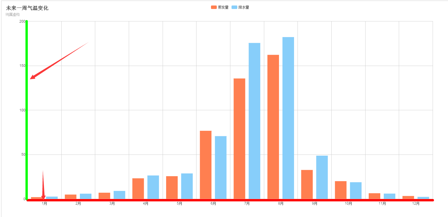
title : {
text: '未来一周气温变化',
subtext: '纯属虚构'
},
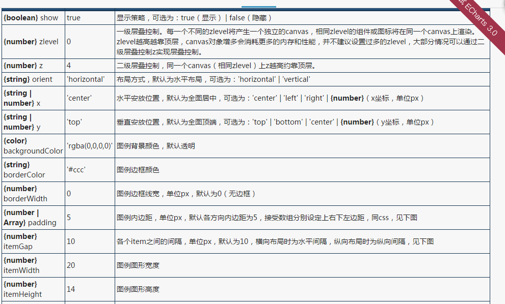
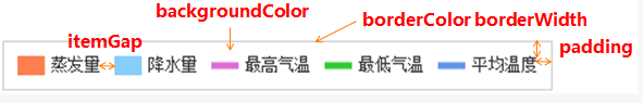
legend: {
data:['蒸发量','降水量']
},
calculable : true,
xAxis : [
{
type : 'category',
data : ['1月','2月','3月','4月','5月','6月','7月','8月','9月','10月','11月','12月'],
axisLine:{
lineStyle:{
color:'#FF0000',
width:8,
}
}
}
],
yAxis : [
{
type : 'value',
axisLine:{
lineStyle:{
color:'#00FF00',
width:8,
}
}
}
],
series : [
{
name:'蒸发量',
type:'bar',
data:[2.0, 4.9, 7.0, 23.2, 25.6, 76.7, 135.6, 162.2, 32.6, 20.0, 6.4, 3.3]
},
{
name:'降水量',
type:'bar',
data:[2.6, 5.9, 9.0, 26.4, 28.7, 70.7, 175.6, 182.2, 48.7, 18.8, 6.0, 2.3]
}
]
});
}
</script>
<body>
<div id="mainBar" style="border:1px solid #ccc;padding:10px;"></div>
<script type="text/javascript" src="http://apps.bdimg.com/libs/echarts/2.1.9/source/echarts-all.js"></script>
<script>
</script>
</body>
</html>
- 1
- 2
- 3
- 4
- 5
- 6
- 7
- 8
- 9
- 10
- 11
- 12
- 13
- 14
- 15
- 16
- 17
- 18
- 19
- 20
- 21
- 22
- 23
- 24
- 25
- 26
- 27
- 28
- 29
- 30
- 31
- 32
- 33
- 34
- 35
- 36
- 37
- 38
- 39
- 40
- 41
- 42
- 43
- 44
- 45
- 46
- 47
- 48
- 49
- 50
- 51
- 52
- 53
- 54
- 55
- 56
- 57
- 58
- 59
- 60
- 61
- 62
- 63
- 64
- 65
- 66
- 67
- 68
- 69
- 70
- 71
- 72
- 73
- 74
- 75
- 76
- 77
- 78
- 79
- 80
- 81
- 82
- 83
- 84
- 85
- 86
- 87
- 88
- 89
- 90
- 91
- 92
- 93
- 94
- 95
- 96
效果图