需要用到自定义input为radio或者checkbox的样式,如下效果图:
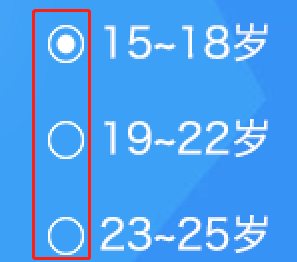

html结构:
<label class='radio-wrap'>
    <input type="radio" name="yearsOld"/>
        <span>15~18岁</span>
</label>
<label class='radio-wrap'>
    <input type="radio" name="yearsOld"/>
        <span>19~22岁</span>
</label>
<label class='radio-wrap'>
    <input type="radio" name="yearsOld"/>
        <span>23~25岁</span>
</label>
sass代码:
.radio-wrap{
    position: relative;
    display:block;
    line-height:.46rem;
    input[type="radio"]{  //input透明化
        position: absolute;
        opacity:0;
        filter:alpha(opacity=0);
    }
    input+span{
        float: left;
        padding:0 0 0 .26rem;
        width:90%;
        background:url('/images/radio-select.png') left center no-repeat; //input相邻节点设置自定义背景
        background-size:.18rem .19rem; 
        font-size:.2rem;
    }
    input:checked+span{
        background:url('/images/radio-selected.png') left center no-repeat; //input选中状态后,相邻节点改变自定义背景
        background-size:.18rem .19rem; 
    }
}
实现原理:
1、将input包裹在label标签中,利用label、input绑定原理,点击label中的内容时,即可对label中的input进行选中和取消选中操作。
2、将input设置为透明。
3、input为未选中时,其相邻节点样式为未选中背景图。
4、input为选中时,其相邻节点样式为选中背景图。
具体情况具体分析,不同项目按照这个原理进行修改即可。
来自   https://blog.csdn.net/ernijie/article/details/88226996