You are here
CSS3中文本的描边(普通描边、凸起、凹陷)和发光效果 文字特效 效果 有大用

text-shadow: x位移 y位移 模糊程度 颜色
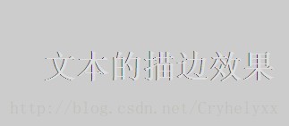
利用text-shadow属性的特性,同时在上,下,左,右中个方向为文字设置多个阴影,且不设置模糊作用距离(即默认没有模糊效果),就可以实现文本的描边效果了。
- <!doctype html>
- <html>
- <head>
- <meta charset="utf-8">
- <title>文本的描边效果</title>
- <style type="text/css">
- p{
- padding:50px;
- font-family:Verdana, Geneva, sans-serif;
- font-weight:bold;
- font-size:36px;
- background-color:#ccc;
- color:#ddd;
- /*普通的描边*/
- text-shadow:-1px 0px #333; /*向左阴影*/
- /*0px -1px #333;*/ /*向上阴影*/
- /*1px 0 #333;*/ /*向右阴影*/
- /*0px 1px #333;*/ /*向下阴影*/
- }
- </style>
- </head>
- <body>
- <p>文本的描边效果</p>
- </body>
- </html>
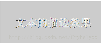
如果将向左和向上的阴影颜色设置为白色,文字就会有凸起的效果。
- <!doctype html>
- <html>
- <head>
- <meta charset="utf-8">
- <title>文本的描边效果</title>
- <style type="text/css">
- p{
- padding:50px;
- font-family:Verdana, Geneva, sans-serif;
- font-weight:bold;
- font-size:36px;
- background-color:#ccc;
- color:#ddd;
- /*文字凸起的效果*/
- text-shadow:-1px 0 #fff, /*向左阴影*/
- 0 -1px #fff, /*向上阴影*/
- 1px 0 #333, /*向右阴影*/
- 0 1px #333; /*向下阴影*/
- }
- </style>
- </head>
- <body>
- <p>文本的描边效果</p>
- </body>
- </html>
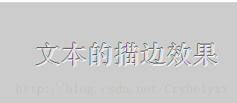
如果将向右和向下的阴影颜色设置为白色,文字就会有凹陷的效果。
- <!doctype html>
- <html>
- <head>
- <meta charset="utf-8">
- <title>文本的描边效果</title>
- <style type="text/css">
- p{
- padding:50px;
- font-family:Verdana, Geneva, sans-serif;
- font-weight:bold;
- font-size:36px;
- background-color:#ccc;
- color:#ddd;
- /*文字凹陷的效果*/
- text-shadow:-1px 0 #333, /*向左阴影*/
- 0 -1px #333, /*向上阴影*/
- 1px 0 #fff, /*向右阴影*/
- 0 1px #fff; /*向下阴影*/
- }
- </style>
- </head>
- <body>
- <p>文本的描边效果</p>
- </body>
- </html>
也可以利用text-shadow属性的特性,不设置水平和垂直的偏移距离,仅设置模糊作用距离,这样就可以通过修改模糊值来实现强度不同的发光效果了。
- <!doctype html>
- <html>
- <head>
- <meta charset="utf-8">
- <title>文本的发光效果</title>
- <style type="text/css">
- p{
- padding:50px;
- font-family:Verdana, Geneva, sans-serif;
- font-weight:bold;
- font-size:36px;
- background-color:#ccc;
- color:#ddd;
- text-shadow:0 0 10px #00F; /*没有偏移的模糊设置*/
- }
- </style>
- </head>
- <body>
- <p>文本的发光效果</p>
- </body>
- </html>

来自 http://blog.csdn.net/cryhelyxx/article/details/13626355
普通分类: